
From Metal Accents to Vibrant Hues: The Trends Shaping 2026 In Decorative Finishes
- Kaitlin

- Feb 3
- 4 min read
Natural Meets Bold
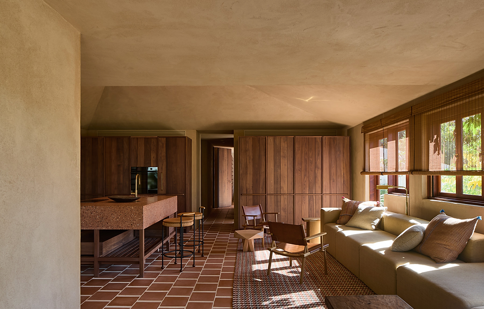
In 2026, Australia is moving beyond its long love affair with soft neutrals, as the trends in decorative finishes embrace colour with more depth, warmth, and personality. Earthy clays, sunbaked terracottas, olive greens, and mineral-rich browns are taking the place of cool beiges, reflecting a desire for spaces that feel lived-in and expressive rather than purely minimal. Venetian plaster plays a key role in this shift, with its natural texture and layered finish giving these bolder, grounded tones a softness and authenticity that paint alone can’t achieve—allowing colour to feel timeless, tactile, and deeply connected to the Australian landscape.
As this shift toward warmer, more expressive colour takes hold across Australia, it’s showing up in a number of distinct yet interconnected design trends. From a renewed appreciation for raw, natural materials to a growing appetite for handcrafted finishes and layered surfaces, interiors are moving away from uniformity and towards individuality. These trends reflect a broader desire for homes that feel grounded in place, shaped by climate and landscape, and rich in texture and tone setting the stage for finishes like Venetian plaster to move from accent feature to defining element in contemporary Australian spaces.
Citrus Hues
Sunlit yellows, ranging from warm mustard to golden ochre, are bringing a subtle sense of brightness and energy to Australian interiors. Rather than overwhelming a space, these tones introduce a gentle glow and refined warmth, catching the light beautifully and adding character without losing balance.

Rich Earthy Tones
From soft clay pinks and dusty blush through to rich burgundy, mulberry, and deep plum, these tones are emerging across Australian interiors as a warmer, more emotive alternative to traditional neutrals. Inspired by local stone, desert landscapes, and a growing appreciation for layered, tactile finishes, these shades add depth and mood without feeling heavy, especially when applied through materials like Venetian plaster that soften colour and highlight its natural variation.

Layered Pinks & Reds
From chalky blush and muted clay pinks through to deep burgundy, mulberry, and plum, these tones are gaining traction in Australian interiors for their ability to bring warmth and emotional depth without tipping into excess. Used thoughtfully, they move beyond decoration, working as layered accents or confident statement moments that add personality and a sense of intimacy to contemporary spaces.

Cool Blues
Icy glacier blue and crisp cerulean provide refreshing contrast, offering clarity and modernity. These cooler tones balance warmer shades and enrich the palette, giving interiors a polished, sophisticated edge.

Saturated Teals
Deep teals and green-blues bring depth and grounded sophistication. Their rich, velvety quality complements both warmer earth tones and cooler blues, creating spaces that feel dynamic, balanced, and connected to nature.

Modern Metal Accents
Metal accents are taking decorative finishes to a whole new level, bringing a playful twist to the design world. Imagine metallics as the bold, eye-catching details in a room, just the right amount of shine and sparkle to make a statement without overwhelming the space.
This year, it’s not just about classic gold or silver anymore; we’re seeing metals in unique tones like copper, aged brass and antique bronze make their way into everything from textured finishes to intricate trim work. These shiny details are being beautifully balanced with softer elements like plush textiles and polished stone, creating a dynamic, yet harmonious feel.


Eco-Chic: The Future of Sustainable and Stylish Finishes
Intonachino Argilla is a sustainable, natural clay plaster designed for environmentally conscious interiors. Made without chemical additives and crafted from high-quality clays, sands, and marble powders, it is non-toxic, free of harmful emissions, and safe for both residential and commercial spaces.
Naturally sourced and recycled additives can be used in clay plasters to introduce variation in texture, tone, and surface depth. Drawn from natural clays, minerals, and recycled materials, these additives allow finishes to be customised through layering and application technique. The result is a range of surfaces, from soft and minimal to more tactile and expressive, while maintaining material integrity and a low environmental impact.

The raw composition and textured finishes evoke a sense of calm and connection to nature. Drawing inspiration from Frank Lloyd Wright’s philosophy of integrating the built environment with the natural world, Intonachino Argilla brings a grounded, harmonious, and timeless quality to interiors, subtly blurring the line between indoors and outdoors.
For the Year Ahead: What You’ll Also See…
Designing for Interaction, Not Just Impression
Commercial interiors, in particular, are being designed as immersive experiences, engaging the senses and creating memorable environments that go beyond aesthetics alone. Retail stores, restaurants, and cafes are no longer only about aesthetics, they are curated to engage the senses, encourage interaction, and create memorable emotional connections with visitors. Every design choice, from materials and textures to lighting and layout, contributes to a story that people can feel, touch, and inhabit.


Comments